The StrongLifts Dashboard is the result of a group project undertaken at Noroff School of Technology and Digital Media. Our team worked together to design a new digital feature for the StrongLifts workout tracker app. This dashboard aims to display a user’s workout progress and useful statistics over time. I had the privilege of contributing to the design, ensuring it aligns with StrongLifts’ brand identity while providing a fresh, motivational interface for users.
Explore the StrongLifts Dashboard and see how we combined creativity and functionality to enhance the workout experience.
Goal & Problem(s)
The goal of designing the StrongLifts Dashboard was to create a comprehensive and user-friendly platform that displays a single user’s workout progress and useful statistics over time. The primary design challenge was to maintain the StrongLifts brand identity while giving the dashboard a fresh look and feel. We aimed to inspire users by making the dashboard a tool for success in their workout journey.


Challenge
Several challenges were faced during the project. We needed to balance the integration of new design elements with the existing StrongLifts branding to ensure a cohesive look. Another significant challenge was designing an interface that was both visually appealing and functionally effective without overwhelming the user. Achieving the right contrast, spacing, and intuitive layout were crucial aspects of the design process.
Process
Our process included several key steps:
Research & Visual Audit: We conducted a thorough visual audit of the existing StrongLifts website and app. This involved identifying fonts, colors, and design elements using tools like "What Font?" and the Five Dimensions model (Words, Images, Space, Time, Behavior).
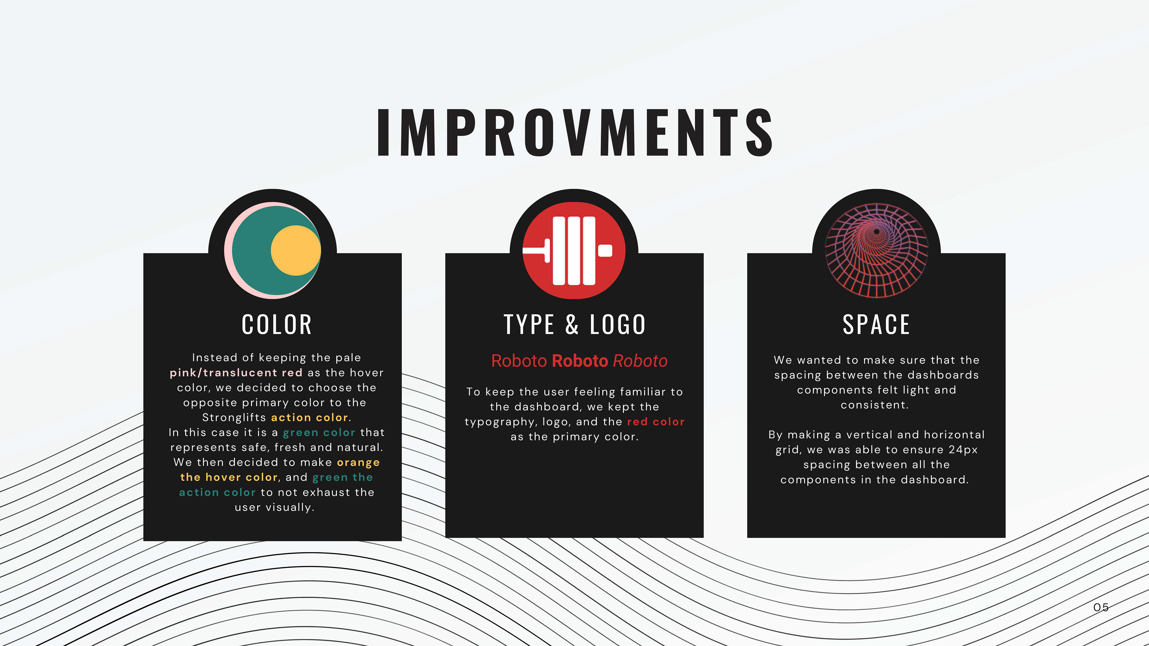
Design System Creation: We reused the existing fonts, choosing colors to meet contrast ratios and evoke the right emotions. We designed a grid to ensure consistent spacing and created buttons and icons for uniformity across different states.
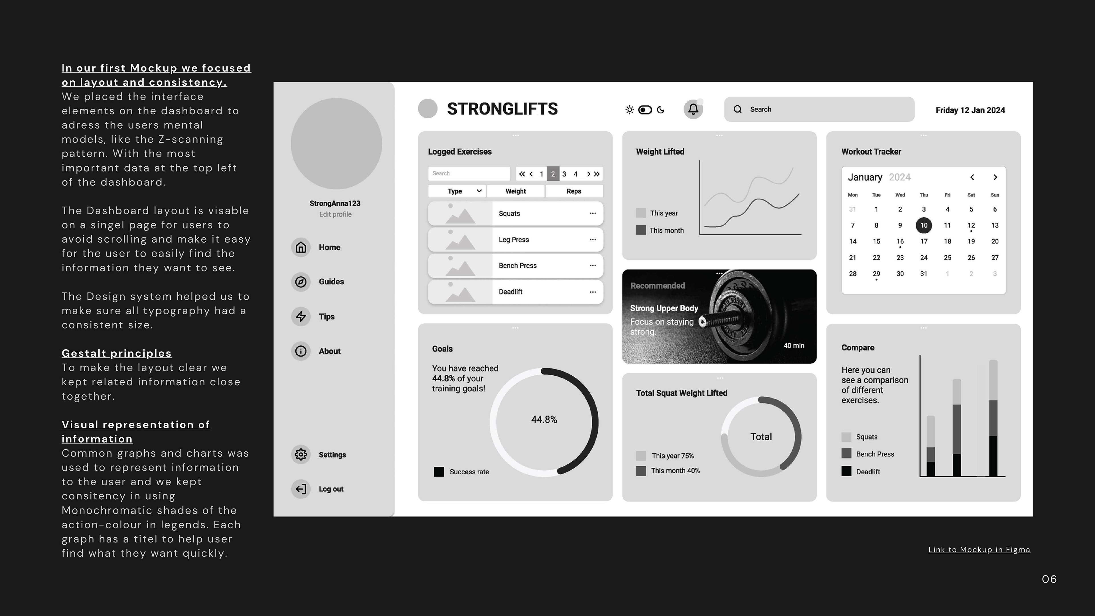
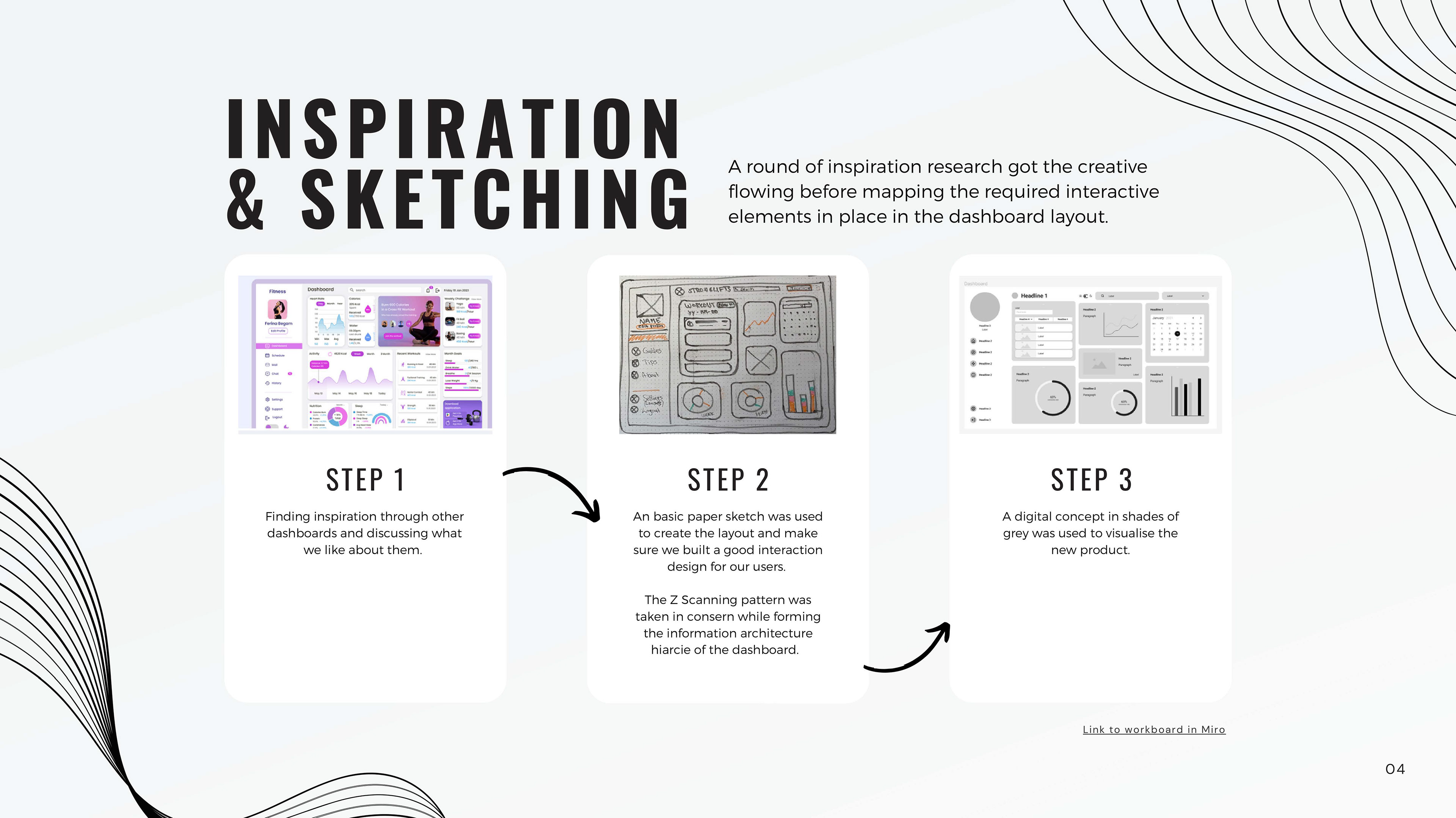
Inspiration & Layout Design: Inspiration research helped spark creativity for mapping interactive elements. We employed the Z-scanning pattern to prioritize information, ensuring the most critical data was placed at the top left of the dashboard.
Mockups & Testing: Our initial mockup focused on layout consistency and user mental models. We used Gestalt principles to keep related information together and common graphs and charts to represent data clearly.
Microcopy & Interaction Design: We used microcopy to fit important data without overloading the user, ensuring readability through careful color and contrast choices. We also incorporated a light and dark mode for user customization.
Results
The end result was an effective and engaging dashboard that aligned with the StrongLifts brand while enhancing the user experience.
The new dashboard was praised for its intuitive navigation, motivational design, and visual appeal. By keeping familiar elements like typography, logos, and primary colors, users felt comfortable and inspired. The integration of emotional design elements, such as positive texts and appropriate imagery, further enhanced user engagement and satisfaction.
